DIGITAL
DESIGN​​
PERSONAL DIGITAL ILLUSTRATION
HELVETICA ONLY
The work shown in this section was produced with the parameter of featuring only the Helvetica font.
​
This project includes a series of three posters regarding one letter from the Phoenician alphabet. One poster was to place emphasis on the informational paragraph (middle), one was to place emphasis on the name of the symbol (left), and one was to place emphasis on the symbol itself (right). The text is from Wikipedia.


This project was to organize type in a way that represents the logical emphasis on certain words via altercation of the font qualities.

.png)
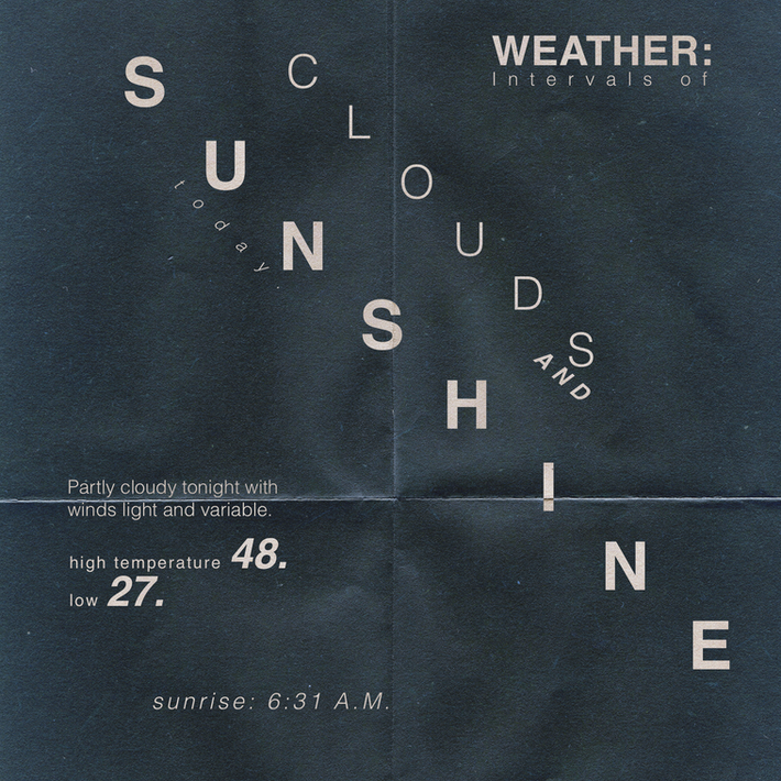
This project was to re-arrange the simple sentence "Weather: Intervals of clouds and sunshine today. Partly cloudy tonight with winds light and variable. High temperature; 48. Low: 27. Sunrise: 6:31 A.M." in five different ways that prioritize readability over legibility.


The following projects were not produced under the "HELVETICA ONLY" parameter.
This project was produced for a "jump the gutter" assignment that required the left page of the spread to directly coordinate with the right page. The passage is from Blambot.com.

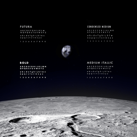
This project required two type specimen posters of contrasting styles to be produced. It had to feature all upper and lowercase letters, as well as numbers 0-9.


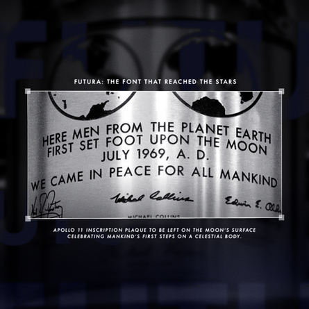
This slideshow features three covers from a "History of Communication and Design" stylebook.
This assignment was to create a word using unconventional materials and/or naturally occurring imagery. I chose to make the word toast!


For this project, I created a logo for my fathers Construction company known as Snyder construction services.


Here are some mock-ups using the logo.


.jpeg)